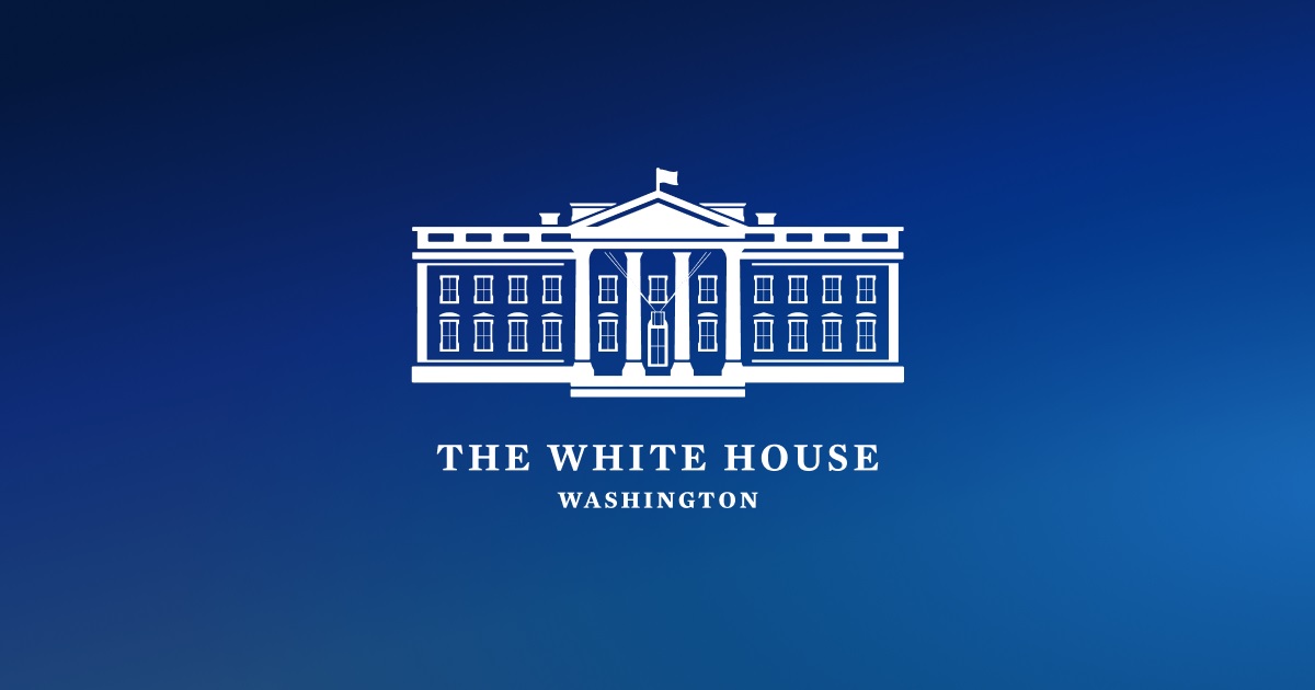
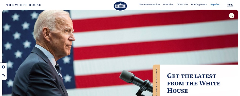
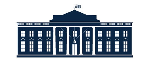
The new White House logo has been unveiled after President Biden approved the design following around thirty attempts to revamp the old design.
Among other changes on the updated White House website, people can now see the new logo which reportedly took dozens of attempts to perfect.
As the Fast Company reported, the Biden administration hired creative agency Wide Eye to design the new logo for the White House.
According to the company’s creative director Ben Ostrower, it took the agency around thirty revisions before the design was approved.
The new logo features the White House, in white color, sitting on a navy-blue background. Besides changes in color, the White House now appears to be more defined with sharper edges around the windows, columns, and walls. There are also more details to the building’s roof.
While the original logo features a white White House on a blue background, the creators have also made a version with inverted colors.
“There’s a bit more texture to [the logo] than you might have on a flatter logo,” Rob Flaherty, the digital strategy director of the White House, said of the new logo.
“It is both forward looking while having its roots in something very traditional. That’s a nice statement about what we’re trying to do here. We are bringing the country together and winning the battle for the soul of the nation, but also trying to do it in a way that makes people’s lives materially better.”
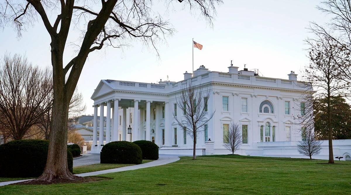
As Flaherty added, the administration stuck to tradition as they chose for the logo to feature the mansion’s northern façade. They also made sure that the door was clearly visible in order to project the idea that the White House is “the people’s house.”
“Our whole pitch, that we assembled in about two to three days, was the idea that the White House is the people’s house,” he added.
What are your thoughts on the new logo? Let us know in the comments and don’t forget to SHARE this post with your family and friends. For more news and stories, follow us on Facebook!


